Joseph's Site
My classwork for BIMM143
Class 18: Pertussis Mini-Project
Joseph Lo (PID: A18121493)
Background
Pertussis (whooping cough) is a common lung infection caused by the bacteria B. Pertussis. It can infect anyone but is most deadly for infants (under 1 year of age)
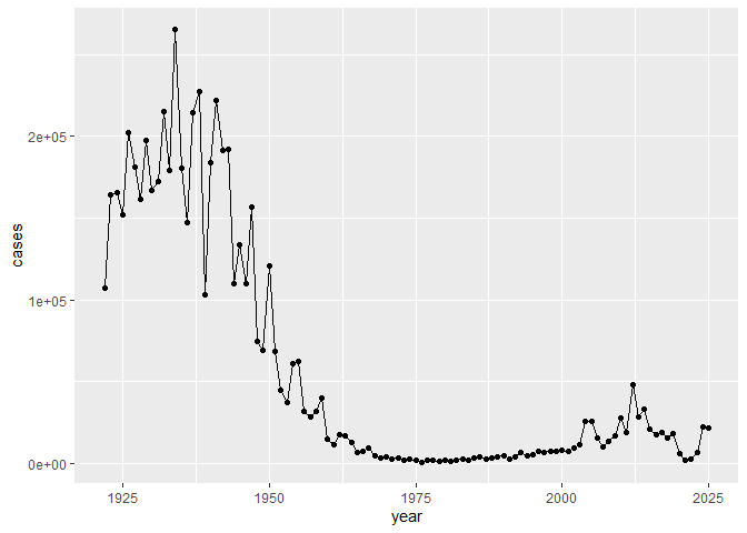
CDC tracking data
The CDC tracks the number of Pertussis cases:
Q. I want a plot of year vs cases
Q1. With the help of the R “addin” package datapasta assign the CDC pertussis case number data to a data frame called cdc and use ggplot to make a plot of cases numbers over time.
library(ggplot2)

ggplot(cdc) +
  aes(year, cases) +
  geom_point() +
  geom_line()
Q. Add annotation lines for the major milestones of wP vaccination roll-out (1946) and the switch to the aP vaccine (1996).
Q2. Using the ggplot geom_vline() function add lines to your previous plot for the 1946 introduction of the wP vaccine and the 1996 switch to aP vaccine (see example in the hint below). What do you notice?
After the introduction of the wP vaccine the rate of the infection decreased; however, after switching to the aP vaccine maybe it wasn’t as strong but it is still pretty effective.
ggplot(cdc) +
  aes(year, cases) +
  geom_point() +
  geom_line() +
  geom_vline(xintercept = 1946, col="blue", lty=2) +
  geom_vline(xintercept = 1996, col="red", lty=2) +
  geom_vline(xintercept = 2020, col="gray", lty=2)
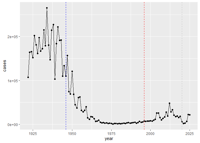
Q3. Describe what happened after the introduction of the aP vaccine? Do you have a possible explanation for the observed trend?
After the introduction of the aP vaccine there is a slight increase in the infection cases. Maybe the bacteria is evolving or that data gathering is evolving, making it easier to identify who is infected and including it into data sets with better accuracy. Also, access to vaccine may be tougher, causing less to get vaccinated.
Q. Additional points for discussion: How are vaccines currently approved?
Vaccines are currently approved through companies like FDA so it will be harder to get modern vaccines improved. There is a more evolved process in approving vaccines and making sure there are no failures.
Exploring CMI-PB data
The CMI-PB project https://www.cmi-pb.org/ The mission of CMI-PB is to provide the scientific community with a comprehensive, high-quality and freely accessible resource of Pertussis booster vaccination.
Basically, make available a large dataset on the immune response to Pertussis. They use a “booster” vaccination as a proxy for Pertussis infection.
They make their data available as JSON format API. We can read this into
R with the read_json() function from the jsonlite package:
library(jsonlite)

subject <- read_json("https://www.cmi-pb.org/api/v5_1/subject", simplifyVector=TRUE)

head(subject)
  subject_id infancy_vac biological_sex              ethnicity  race
1          1          wP         Female Not Hispanic or Latino White
2          2          wP         Female Not Hispanic or Latino White
3          3          wP         Female                Unknown White
4          4          wP           Male Not Hispanic or Latino Asian
5          5          wP           Male Not Hispanic or Latino Asian
6          6          wP         Female Not Hispanic or Latino White
  year_of_birth date_of_boost      dataset
1    1986-01-01    2016-09-12 2020_dataset
2    1968-01-01    2019-01-28 2020_dataset
3    1983-01-01    2016-10-10 2020_dataset
4    1988-01-01    2016-08-29 2020_dataset
5    1991-01-01    2016-08-29 2020_dataset
6    1988-01-01    2016-10-10 2020_dataset
Q. How many aP and wP individuals are there in this
subjecttable?
table(subject$infancy_vac)
aP wP
87 85
Q4. How many aP and wP infancy vaccinated subjects are in the dataset?
87 aP and 85 wP
How many male/female >Q5. How many Male and Female subjects/patients are in the dataset?
table(subject$biological_sex)
Female   Male
   112     60
112 Female 60 Male
Q6. What is the breakdown of
raceandbiological sex(e.g. number of Asian females, White males etc…)? Is this representative of the US population?
table(subject$race, subject$biological_sex)
                                            Female Male
  American Indian/Alaska Native                  0    1
  Asian                                         32   12
  Black or African American                      2    3
  More Than One Race                            15    4
  Native Hawaiian or Other Pacific Islander      1    1
  Unknown or Not Reported                       14    7
  White                                         48   32
The breakdown is as shown above.
It is not representative of the US population because it is too little datasets.
We can read more tables from the CMI-PB database
specimen <- read_json("https://www.cmi-pb.org/api/v5_1/specimen", simplifyVector = TRUE)
ab_titer <- read_json("https://www.cmi-pb.org/api/v5_1/plasma_ab_titer", simplifyVector = TRUE)
head(specimen)
  specimen_id subject_id actual_day_relative_to_boost
1           1          1                           -3
2           2          1                            1
3           3          1                            3
4           4          1                            7
5           5          1                           11
6           6          1                           32
  planned_day_relative_to_boost specimen_type visit
1                             0         Blood     1
2                             1         Blood     2
3                             3         Blood     3
4                             7         Blood     4
5                            14         Blood     5
6                            30         Blood     6
head(ab_titer)
  specimen_id isotype is_antigen_specific antigen        MFI MFI_normalised
1           1     IgE               FALSE   Total 1110.21154       2.493425
2           1     IgE               FALSE   Total 2708.91616       2.493425
3           1     IgG                TRUE      PT   68.56614       3.736992
4           1     IgG                TRUE     PRN  332.12718       2.602350
5           1     IgG                TRUE     FHA 1887.12263      34.050956
6           1     IgE                TRUE     ACT    0.10000       1.000000
   unit lower_limit_of_detection
1 UG/ML                 2.096133
2 IU/ML                29.170000
3 IU/ML                 0.530000
4 IU/ML                 6.205949
5 IU/ML                 4.679535
6 IU/ML                 2.816431
To make sense of all this data we need to “join” (a.k.a. “merge” or
“link”) all these tables together. Only then will you know that a given
Ab measurement (from the ab_titer table) was collected on a certain
data (from the specimen table) from a certain wP or aP subject (from
the subject table).
We can use dplyr and the *_join() family of functions to do this.
Q9. Complete the code to join specimen and subject tables to make a new merged data frame containing all specimen records along with their associated subject details:
library(dplyr)
Attaching package: 'dplyr'

The following objects are masked from 'package:stats':

    filter, lag

The following objects are masked from 'package:base':

    intersect, setdiff, setequal, union
meta <- inner_join(subject, specimen)
Joining with `by = join_by(subject_id)`
head(meta)
  subject_id infancy_vac biological_sex              ethnicity  race
1          1          wP         Female Not Hispanic or Latino White
2          1          wP         Female Not Hispanic or Latino White
3          1          wP         Female Not Hispanic or Latino White
4          1          wP         Female Not Hispanic or Latino White
5          1          wP         Female Not Hispanic or Latino White
6          1          wP         Female Not Hispanic or Latino White
  year_of_birth date_of_boost      dataset specimen_id
1    1986-01-01    2016-09-12 2020_dataset           1
2    1986-01-01    2016-09-12 2020_dataset           2
3    1986-01-01    2016-09-12 2020_dataset           3
4    1986-01-01    2016-09-12 2020_dataset           4
5    1986-01-01    2016-09-12 2020_dataset           5
6    1986-01-01    2016-09-12 2020_dataset           6
  actual_day_relative_to_boost planned_day_relative_to_boost specimen_type
1                           -3                             0         Blood
2                            1                             1         Blood
3                            3                             3         Blood
4                            7                             7         Blood
5                           11                            14         Blood
6                           32                            30         Blood
  visit
1     1
2     2
3     3
4     4
5     5
6     6
Let’s do one more innter_join() to join the ab_titer with all our
meta data.
Q10. Now using the same procedure join meta with titer data so we can further analyze this data in terms of time of visit aP/wP, male/female etc.
abdata <- inner_join(ab_titer, meta)
Joining with `by = join_by(specimen_id)`
head(abdata)
  specimen_id isotype is_antigen_specific antigen        MFI MFI_normalised
1           1     IgE               FALSE   Total 1110.21154       2.493425
2           1     IgE               FALSE   Total 2708.91616       2.493425
3           1     IgG                TRUE      PT   68.56614       3.736992
4           1     IgG                TRUE     PRN  332.12718       2.602350
5           1     IgG                TRUE     FHA 1887.12263      34.050956
6           1     IgE                TRUE     ACT    0.10000       1.000000
   unit lower_limit_of_detection subject_id infancy_vac biological_sex
1 UG/ML                 2.096133          1          wP         Female
2 IU/ML                29.170000          1          wP         Female
3 IU/ML                 0.530000          1          wP         Female
4 IU/ML                 6.205949          1          wP         Female
5 IU/ML                 4.679535          1          wP         Female
6 IU/ML                 2.816431          1          wP         Female
               ethnicity  race year_of_birth date_of_boost      dataset
1 Not Hispanic or Latino White    1986-01-01    2016-09-12 2020_dataset
2 Not Hispanic or Latino White    1986-01-01    2016-09-12 2020_dataset
3 Not Hispanic or Latino White    1986-01-01    2016-09-12 2020_dataset
4 Not Hispanic or Latino White    1986-01-01    2016-09-12 2020_dataset
5 Not Hispanic or Latino White    1986-01-01    2016-09-12 2020_dataset
6 Not Hispanic or Latino White    1986-01-01    2016-09-12 2020_dataset
  actual_day_relative_to_boost planned_day_relative_to_boost specimen_type
1                           -3                             0         Blood
2                           -3                             0         Blood
3                           -3                             0         Blood
4                           -3                             0         Blood
5                           -3                             0         Blood
6                           -3                             0         Blood
  visit
1     1
2     1
3     1
4     1
5     1
6     1
Q11. How many specimens (i.e. entries in abdata) do we have for each isotype?
table(abdata$isotype)
  IgE   IgG  IgG1  IgG2  IgG3  IgG4
 6698  7265 11993 12000 12000 12000
The species amounts are shown above.
Q. How many different “antigen” values are measured?
table(abdata$antigen)
    ACT   BETV1      DT   FELD1     FHA  FIM2/3   LOLP1     LOS Measles     OVA
   1970    1970    6318    1970    6712    6318    1970    1970    1970    6318
    PD1     PRN      PT     PTM   Total      TT
   1970    6712    6712    1970     788    6318
Q12. What are the different $dataset values in abdata and what do you notice about the number of rows for the most “recent” dataset?
table(abdata$dataset)
2020_dataset 2021_dataset 2022_dataset 2023_dataset
       31520         8085         7301        15050
The most recent data set seems to have a jump in its number compared to previous years.
igg <- abdata %>% filter(isotype == "IgG")
head(igg)
  specimen_id isotype is_antigen_specific antigen        MFI MFI_normalised
1           1     IgG                TRUE      PT   68.56614       3.736992
2           1     IgG                TRUE     PRN  332.12718       2.602350
3           1     IgG                TRUE     FHA 1887.12263      34.050956
4          19     IgG                TRUE      PT   20.11607       1.096366
5          19     IgG                TRUE     PRN  976.67419       7.652635
6          19     IgG                TRUE     FHA   60.76626       1.096457
   unit lower_limit_of_detection subject_id infancy_vac biological_sex
1 IU/ML                 0.530000          1          wP         Female
2 IU/ML                 6.205949          1          wP         Female
3 IU/ML                 4.679535          1          wP         Female
4 IU/ML                 0.530000          3          wP         Female
5 IU/ML                 6.205949          3          wP         Female
6 IU/ML                 4.679535          3          wP         Female
               ethnicity  race year_of_birth date_of_boost      dataset
1 Not Hispanic or Latino White    1986-01-01    2016-09-12 2020_dataset
2 Not Hispanic or Latino White    1986-01-01    2016-09-12 2020_dataset
3 Not Hispanic or Latino White    1986-01-01    2016-09-12 2020_dataset
4                Unknown White    1983-01-01    2016-10-10 2020_dataset
5                Unknown White    1983-01-01    2016-10-10 2020_dataset
6                Unknown White    1983-01-01    2016-10-10 2020_dataset
  actual_day_relative_to_boost planned_day_relative_to_boost specimen_type
1                           -3                             0         Blood
2                           -3                             0         Blood
3                           -3                             0         Blood
4                           -3                             0         Blood
5                           -3                             0         Blood
6                           -3                             0         Blood
  visit
1     1
2     1
3     1
4     1
5     1
6     1
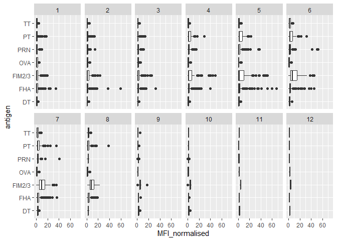
Q13. Complete the following code to make a summary boxplot of Ab titer levels (MFI) for all antigens:
library(ggplot2)
ggplot(igg) +
  aes(MFI_normalised, antigen) +
  geom_boxplot() +
  xlim(0,75) +
  facet_wrap(vars(visit), nrow=2)
Warning: Removed 5 rows containing non-finite outside the scale range
(`stat_boxplot()`).
Let’s focus on IgG isotype
igg <- abdata |>
  filter(isotype=="IgG")

head(igg)
  specimen_id isotype is_antigen_specific antigen        MFI MFI_normalised
1           1     IgG                TRUE      PT   68.56614       3.736992
2           1     IgG                TRUE     PRN  332.12718       2.602350
3           1     IgG                TRUE     FHA 1887.12263      34.050956
4          19     IgG                TRUE      PT   20.11607       1.096366
5          19     IgG                TRUE     PRN  976.67419       7.652635
6          19     IgG                TRUE     FHA   60.76626       1.096457
   unit lower_limit_of_detection subject_id infancy_vac biological_sex
1 IU/ML                 0.530000          1          wP         Female
2 IU/ML                 6.205949          1          wP         Female
3 IU/ML                 4.679535          1          wP         Female
4 IU/ML                 0.530000          3          wP         Female
5 IU/ML                 6.205949          3          wP         Female
6 IU/ML                 4.679535          3          wP         Female
               ethnicity  race year_of_birth date_of_boost      dataset
1 Not Hispanic or Latino White    1986-01-01    2016-09-12 2020_dataset
2 Not Hispanic or Latino White    1986-01-01    2016-09-12 2020_dataset
3 Not Hispanic or Latino White    1986-01-01    2016-09-12 2020_dataset
4                Unknown White    1983-01-01    2016-10-10 2020_dataset
5                Unknown White    1983-01-01    2016-10-10 2020_dataset
6                Unknown White    1983-01-01    2016-10-10 2020_dataset
  actual_day_relative_to_boost planned_day_relative_to_boost specimen_type
1                           -3                             0         Blood
2                           -3                             0         Blood
3                           -3                             0         Blood
4                           -3                             0         Blood
5                           -3                             0         Blood
6                           -3                             0         Blood
  visit
1     1
2     1
3     1
4     1
5     1
6     1
Make a plot of MFI_normalised values for all antigen values.
ggplot(igg) +
  aes(MFI_normalised, antigen) +
  geom_boxplot()
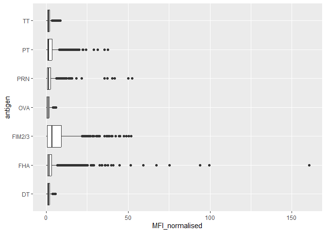
Q14. What antigens show differences in the level of IgG antibody titers recognizing them over time? Why these and not others?
The antigens “PT”, “FTM2/3” and “FHA” appear to have the widest range of values. It is because the aP vaccines utilize these antibodies compared to wP which do not. This introduces more of these antibodies, thus the reason why we see more of them over time and different levels.
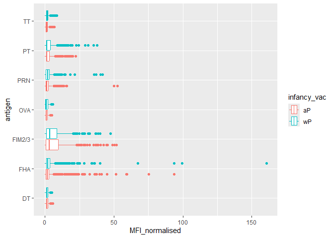
Q. Is there a difference for these responses between aP and wP individuals?
ggplot(igg) +
  aes(MFI_normalised, antigen, col=infancy_vac) +
  geom_boxplot()
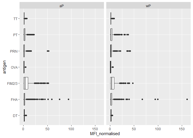
ggplot(igg) +
  aes(MFI_normalised, antigen) +
  geom_boxplot() +
  facet_wrap(~infancy_vac)
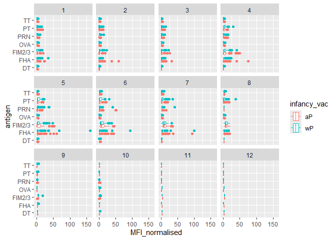
Q.Is there a difference with time (i.e. before booster shot vs after booster shot)
ggplot(igg) +
  aes(MFI_normalised, antigen, col=infancy_vac) +
  geom_boxplot() +
  facet_wrap(~visit)
Lets finish this section by looking at the 2021 dataset IgG PT antigen levels time-course:
## filter to 2021 dataset, IgG and PT only
ab.PT.21 <- abdata |> filter(dataset == "2021_dataset",isotype == "IgG",  antigen == "PT")

  ggplot(ab.PT.21) +
    aes(x=planned_day_relative_to_boost,
        y=MFI_normalised,
        col=infancy_vac,
        group=subject_id) +
    geom_point(alpha=0.4, size=1.5) +
    geom_line(alpha=0.25, linewidth=0.6) +
     stat_summary(fun=mean, geom="smooth", se=FALSE, linewidth=1.6, span=0.5, aes(group=infancy_vac, col=infancy_vac)) +
    geom_vline(xintercept=0, linetype="dashed") +
    geom_vline(xintercept=14, linetype="dashed") +
  labs(title="CMI-PB 2021 dataset IgG PT",
       subtitle = "Dashed lines indicate day 0 (pre-boost) and day 14 (post boost)") +
      theme_minimal(base_size=14)
Warning in stat_summary(fun = mean, geom = "smooth", se = FALSE, linewidth =
1.6, : Ignoring unknown parameters: `span`
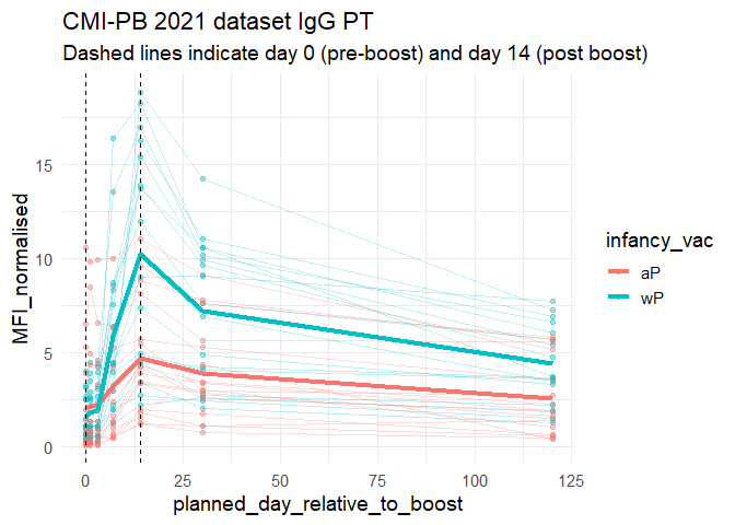
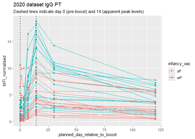
Q18. Does this trend look similar for the 2020 dataset?
Yes this trend looks similar to the 2020 dataset.
ab.PT.20 <- abdata |> filter(dataset == "2020_dataset",isotype == "IgG",  antigen == "PT")


  ggplot(ab.PT.21) +
    aes(x=planned_day_relative_to_boost,
        y=MFI_normalised,
        col=infancy_vac,
        group=subject_id) +
    geom_point() +
    geom_line() +
    geom_vline(xintercept=0, linetype="dashed") +
    geom_vline(xintercept=14, linetype="dashed") +
  labs(title="2020 dataset IgG PT",
       subtitle = "Dashed lines indicate day 0 (pre-boost) and 14 (apparent peak levels)")